Before and After Websites
We take a look at 3 websites before and after they had a makeover.
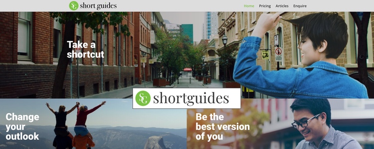
Hero Image – Text Overlay
The hero image – or header banner image – has a big impact as its what people see when they first come to the site.
In our first example we can see the original website had a lot of text over the image, which rather spoiled the serenity.

Before

After
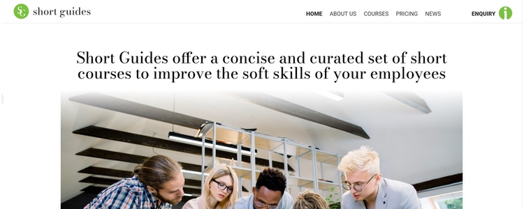
Hero Image – Keeping up with Trends
I rather like the before on this one, but it was a little dated.

Before

After
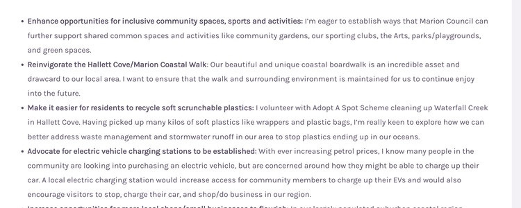
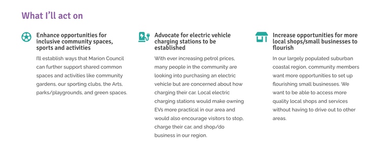
Displaying Content
People tend to skim read a website before they decide if they will give it their full attention. Providing text in short content blocks, with other design elements, makes it more inviting to read.

Before

After
The 1st and 3rd website featured in this article were designed by Richard Blinco of DIY Digital. The 2nd website was designed by Roberto Massaglia of Arte and built by Richard of DIY Digital. If your site is looking a little old, dated or worn, feel free to contact to see how we can help.

Your New Beautiful Website
Affordable, custom built websites for small businesses, local shops, professionals, tradies and solopreneurs.
