The website header
As the name suggests, the website header is at the head, or top, of the page. It has particular significance as it will be at the top of EVERY page on your website.
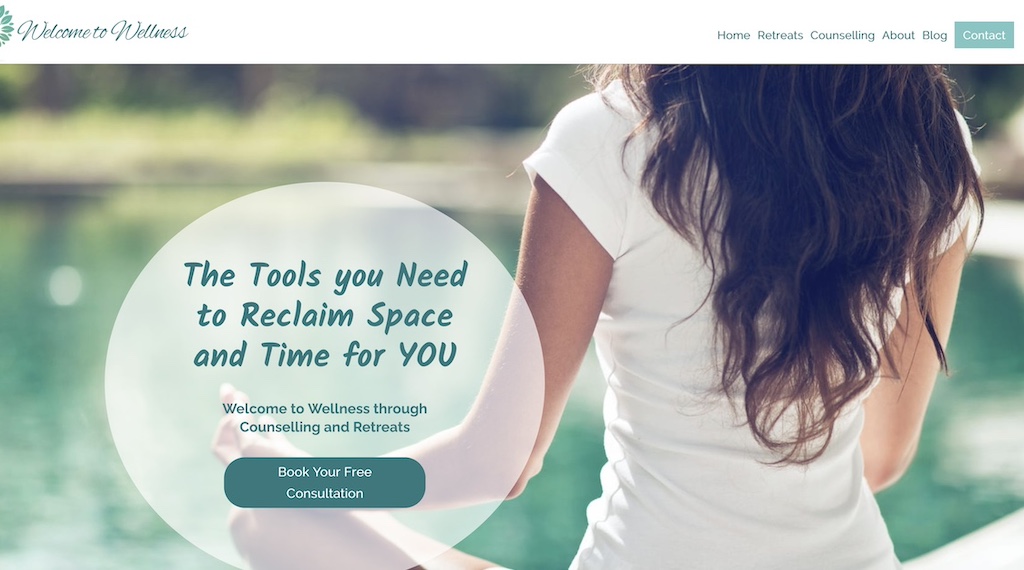
The website header goes a long way towards determining the look and feel of your site. The colours are likely to be your key brand colours. It will often have your logo in the top left.
The website header goes a long way towards determining the functionality of your site, as it houses the menu. The navigation menu is the list of key pages within your site. You may know them as tabs.
A header is often one of the most tricky parts of the website to edit. Spending time getting it right when the website is first developed is time well spent.
A website header will look different depending on whether you are looking at the site on a desktop, tablet or smartphone. Most navigation menu’s appear as 3 bars (often called a hamburger menu) on a mobile phone.
Examples of website headers
Contact Details
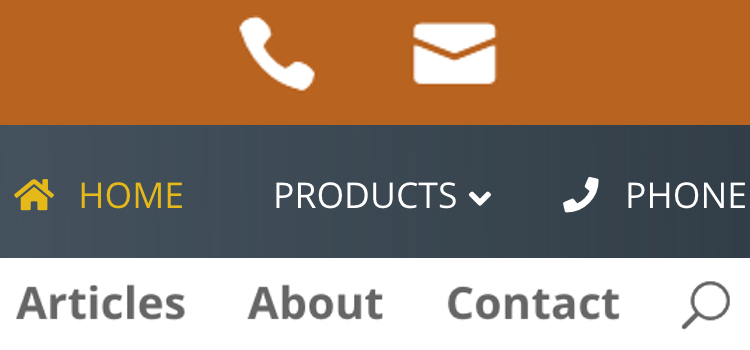
It’s common to include contact details above the navigation menu, as can be seen in the Julia Brown Naturopathy website.
Search – Magnify Glass
For sites that have a lot of information, or are academic or specialty industries, a search bar can be useful to include in the navigation menu, as can be seen in the Intercultural Readiness website with the magnifying glass icon.
This site also demonstrates keeping words as simple as possible, for example Contact rather than Contact Us. Using the least amount of characters and words across the navigation menu is good practice.
Dark Background
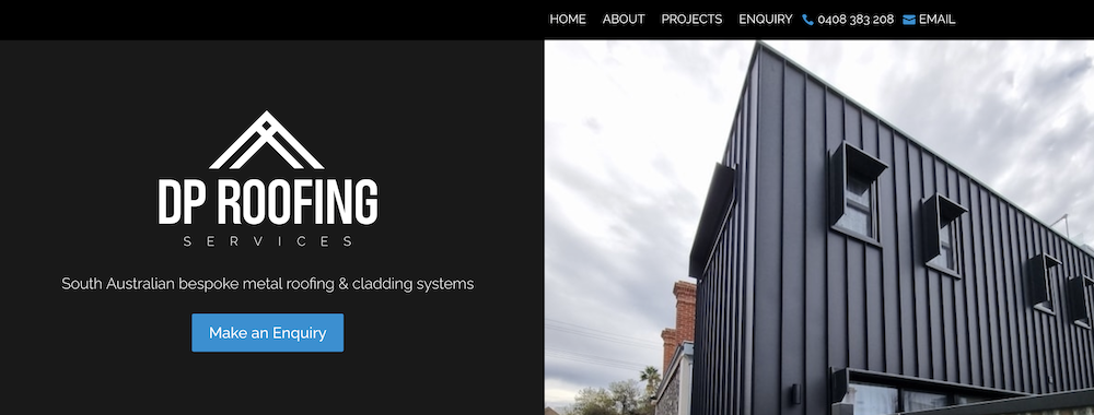
Most website headers are coloured text on white background, but in the example of DP Roofing a dark background colour was chosen with light coloured text.
Mega Menu
In the case of Lasers and Levels Online, there were so many things to include, there is a double navigation menu. Usually we’d like to keep the menu nice and simple, but this is an example where there were lots of pages and products, and a 2nd row was added.
Side Menu
Most menus are at the top, but Beachside Physio opted for a navigation menu on the left hand side.
Creating your website header
Answering the following questions will help you decide upon the design and look of your website header.
- What colours are in your logo or best represent your brand?
- Do you want a striking bold colour, a subdued pastel or a crisp white?
- Do you have the perfect photo or image concept that reflects the personality of your business?
- Do you want simplicity or an eclectic funky mix of icons and images?
Answering the following questions will assist with decisions that impact the functionality of your header.
- What pages are the most important for your website visitor to click to?
- Is there a shop, appointment page or registration form button or link to be included?
- What’s the key action you want a visitor to do when they reach your site?
- How many social media channels do you have and do you want the icons with a link to appear at the top of your site?
Banner Image
A stunning image can go a long way to making your website header, and therefore your website look great. Do you have a great photo that represents your business or where your business is located? Do you have an image that has been professionally designed that can be used?
Head over to our 5 step website plan for a few examples of banner images.
Logo
A good logo will create a great first impression, set you apart from your competitors, create a memorable identity and give your business the professional edge.
If you are a start-up and have not yet got a logo, or you don’t wish to invest in one, you can still create a website without one. Benita Mae is an example of a website without a logo. Although you can create a website without a logo, it is preferable to have one.
Final Thoughts
Hiring a professional website developer, like us 😀, will be a great choice if you want a great looking website with a functional and good looking header.

Your New Beautiful Website
Affordable, custom built websites for small businesses, local shops, professionals, tradies and solopreneurs.


